
Let the colours… come in
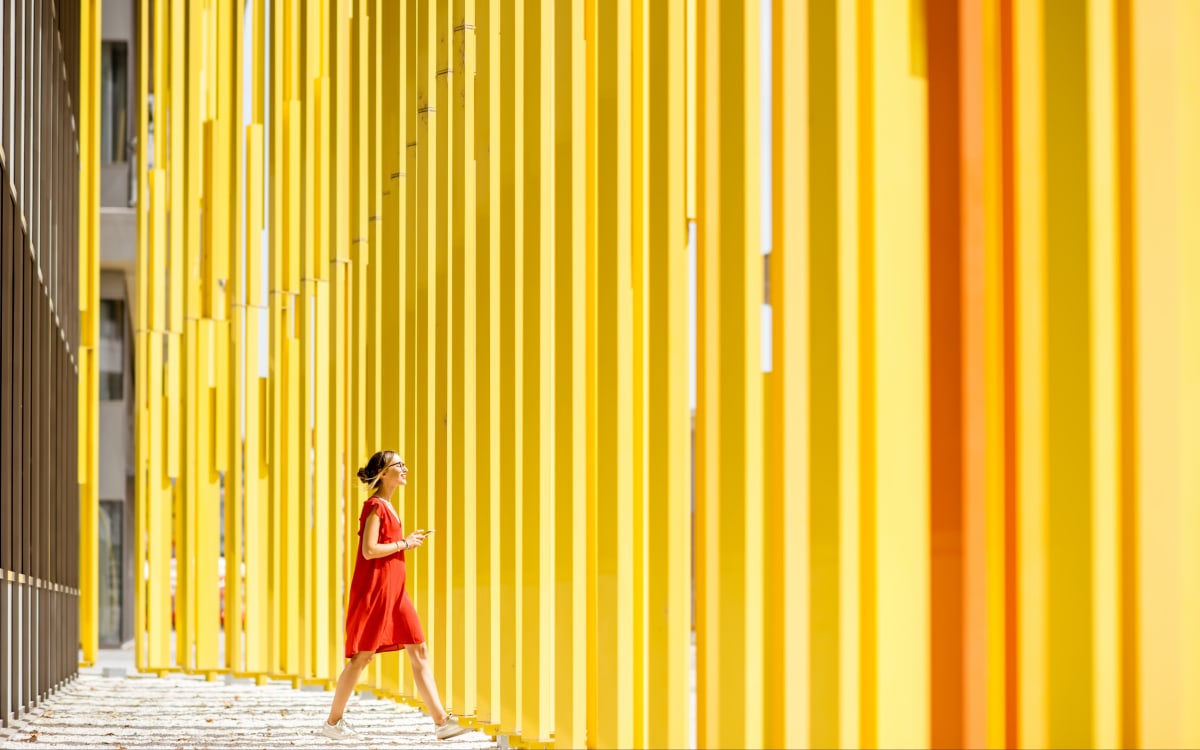
This morning, like every morning, I get dressed and realise that, once again, I’m wearing black and grey. Sadly, it’s just like the weather we’re having this February. “At least it goes with everything, and it’s elegant,” I tell myself. Later, at my desk, I come across a recent British study in the newspaper (well, OK, on my screen), conducted by the London Natural History Museum, which has shed light on a fascinating phenomenon: colour is increasingly disappearing from our daily lives. We are witnessing the great fading of colours.
By analysing more than 7,000 objects from the 20th century to the present day – clothes, cars, household appliances – the researchers observed a clear trend towards chromatic standardisation. Whilst bright colours dominated in the 1970s, neutral shades – grey, black, white and beige – now reign supreme.
This shift in our tastes also reflects changes in our lifestyles, our aspirations and, perhaps even more so, our fears. Let me explain.
In one respect, we perceive neutral colours as more timeless, easier to coordinate and, above all, easier to resell second-hand. A black jumper is a staple, a grey car finds a buyer more easily on the second-hand market, and a beige sofa fits into any interior.
A story of good taste
Black and grey are versatile colours that minimise the risk of making a mistake – that much is true. Wearing a yellow shirt or buying a red sofa are choices that seem to go against the prevailing notion of ‘good taste’. And remember, according to Bourdieu, good taste – far from reflecting our true preferences – is what sets us apart from the working classes. It was, in fact, in this very spirit that the punk movement emerged in the 1970s. To rebel against sanitised bourgeois dictates, by taking every possible liberty and celebrating what is perceived by them as ‘bad taste’. I stumbled across a rather dismal Instagram post the other day, which recommended wearing beige, white or black, and doing away with colour altogether to ‘look rich’.
These days, a pink or green mobile phone is a rare sight, and when you do see one, it’s usually an entry-level model – proof that colour is now seen as a step backwards. I remember attending a meeting where one man said to another, who was sporting a fluorescent yellow and green phone case, with a hint of disdain: “What on earth prompted that choice of colours?” As if to say, “Why don’t you conform? What message are you trying to send?” It’s likely that this person wants to express themselves through their own tastes and aspirations without feeling the pressure to be like everyone else in order to be accepted and understood. And that would be marvellous. I’ve always admired “colourful” people who aren’t afraid to express their individuality.
The fear of judgement

In a world where image is omnipresent and constantly scrutinised on social media, neutrality represents a form of conformity – and therefore of protection. And this is precisely where we touch on a sensitive issue: Instagram, TikTok, Pinterest and the like have accelerated the standardisation of aesthetics. The home design trends are a perfect illustration of this: an avalanche of white and beige living rooms. It’s becoming difficult to tell one flat from another, so identical are the design codes.
The disappearance of colour isn’t limited to fashion or interior design; it also affects everyday objects. Our phones are all black or grey, too. So are our computers. Our cars, our smartwatches, our earphones… The era of brightly coloured gadgets, such as the translucent, vibrant iMacs of the 2000s, seems to be over. Today, it is the reign of charcoal grey.
Yet neuroscience has shown that colours influence our emotions. Gratitude and balance, for example, are often associated with the colour green, whilst brown is more closely linked to shame or even anger. Yellow often evokes joy and optimism.
So we might ask ourselves: does the gradual disappearance of colour suggest a collective emotional chill? If we surround ourselves with beige, grey and black, are we in fact seeking to contain our emotions, to neutralise ourselves?
Are we not depriving ourselves of a more emotional connection to objects? In the past, owning a colourful object was a way of asserting one’s personality, taste, or even social status. Today, neutrality has become the norm, to the extent that the only form of whimsy tacitly permitted is accessorising.
History always brings us back to colour
I did, of course, wonder whether this trend should be seen as a sign of growing environmental awareness. One might think that moving away from bright colours goes hand in hand with a desire to consume more modestly. The minimalist aesthetic, popularised by the less is more movement, advocates for uncluttered décor and neutral clothing, but this chromatic neutrality does not prevent overconsumption. Buying ten grey jumpers is no more environmentally friendly than buying one red one. Similarly, an all-beige interior is not necessarily sustainable if it is based on mass-produced, disposable furniture. True simplicity lies not in colour, but in the choice of sustainable materials, high-quality items, and sensible consumption.
History shows that colour is often a reflection of the spirit of an era. In the 1930s, at the height of the Great Depression, sombre and understated fashion reflected a gloomy and austere atmosphere. After the Second World War, Christian Dior launched his famous “New Look”: dresses in vibrant colours, symbolising renewal and hope. Later, between the 1960s and 1970s, an explosion of colour accompanied protest movements, optimism and freedom of expression. Since the 2000s, with a succession of crises – be they health-related, economic, environmental or ecological – bright colours have receded, giving way to a more subdued palette. More recently, following the Covid-19 crisis, Pantone has chosen “Viva Magenta” as its colour of the year for 2023, a vivid and vibrant shade intended to embody a return to boldness. If we opt for grey, black and beige today, it may be because we live in an age where risk is frightening and where we seek to avoid making mistakes.
Colour is the bold expression of joy

In this context, whilst choosing a neutral colour means fading into the background in favour of the norm, choosing colour means choosing to exist. And from my brief experience, making one’s presence felt remains one of the greatest sources of joy and a sense of gratitude.
Colour should not be seen as merely an aesthetic element, because it is so much more than that. In nature, it is essential. Flowers compete with one another in colour (and therefore in beauty) to attract as many pollinators as possible and thus ensure the survival of their species.
Colour is an expression of vitality, pleasure and emotion. As we observe the gradual disappearance of colour from our lives – from our clothes, our interiors and our everyday objects – we might wonder whether this reflects a certain atrophy of pleasure and a restraint in the way we experience joy.
Moreover, on closer inspection, colour functions much like joy. It radiates outwards immediately. It cannot be controlled; it is something to be experienced. It catches the eye, provokes a reaction and marks our presence.
The fact that we are gradually allowing colours to fade may be a sign of a more cautious approach to joy. We live in an age where discretion is valued, where restraint and moderation are prioritised. Chromatic neutrality is becoming a metaphor for our tendency to smooth over our emotions, to avoid anything that might be too vivid, too striking, too distinctive.
Joy versus the fear of judgement
The standardisation of colours also reveals a form of collective self-censorship, in that colour represents boldness, spontaneity and, above all, necessary imperfection.
True joy arises neither from restraint nor from caution. It arises from letting go, from spontaneous enthusiasm, from the pleasure of playing with shapes, colours and textures. It arises from daring to be different, without seeking to please everyone. Colour is a statement. It expresses a mood, a spirit. In a society that increasingly values control and uniformity, colour has always been a joyful act of resistance.
Let’s be clear: white, beige and black are lovely to wear, and there’s no question of banning them. But in this month of February, which is struggling to let the sun in, let’s resist the shadows in our lives and let, let the colours in.
Warm regards,
Inès Leonarduzzi.

Inès Leonarduzzi is a socio-environmentalist. A few years ago, she founded an NGO that advocates for and promotes digital technology that consumes less energy and is kinder to our brains. She is the author of the essay *Réparer le futur* (Published by Observatoire, 2021) and gives talks in France and abroad on a variety of topics, ranging from the environment to culture, including our new ways of living (together). She occasionally writes poetry. Every month throughout 2025, she invites readers to come together on Aroma-Zone.com to explore the theme of joy, so that we may collectively discover the possibilities for a daily life which, despite its ups and downs, is worth living.


